Ethereum Rainbow Chart – Price Forecast 10000
Table of Contents
I. A Comprehensive Guide to the Ethereum Rainbow Chart: Introduction
Hello, fellow crypto enthusiasts! As someone who’s been in the space for quite some time, I can’t tell you how many charts, trends, and investment advice I’ve come across. Today, I want to introduce you to a fun and valuable tool that has helped me navigate the crypto market and make more informed decisions: the Ethereum Rainbow Chart.
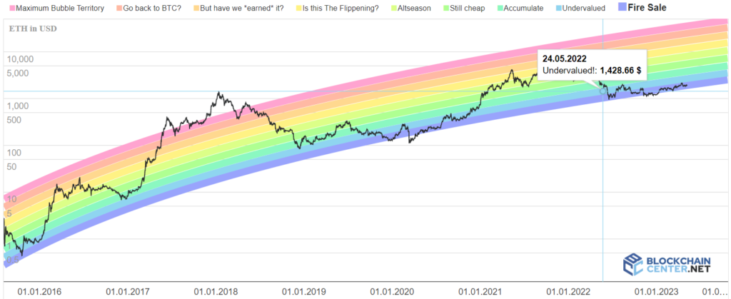
The Ethereum Rainbow Chart (or ETH Rainbow Chart) is a colorful representation of Ethereum’s price movements over time, using a logarithmic growth curve. It’s a fantastic tool for beginners and seasoned investors to get a quick view of the overall trend in the Ethereum market. And guess what? It’s not just limited to Ethereum! There’s a similar chart for Bitcoin called the Bitcoin Rainbow Chart, which I’ll touch upon later.
But first, let’s dive into the Ethereum Rainbow Chart and see what makes it unique. This chart uses a color-coded logarithmic regression to represent the price range of Ethereum (ETH) at any given date. By taking note of the difference in the colors, you can determine whether the market is in a buying, selling, or holding phase. The colors range from purple (deeply undervalued) to pink (maximum bubble territory), making it easy to forecast potential market cycles.
One of the key differences between the Ethereum Rainbow Chart and other charts is its time frame. The chart provides a more long-term view, making it perfect for long-term investors who want to follow the overall trend without getting caught up in short-term fluctuations. It’s important to note that this tool should not be your sole basis for making investment decisions. Always conduct your own research and consider multiple data sources before committing to any investments.
As an experienced investor, rainbow charts, including both the Ethereum and Bitcoin versions, can be incredibly helpful in informing long-term investors about the market’s general direction. They also offer valuable insights into how Ethereum and Bitcoin prices have behaved historically, which can help inform your future valuation expectations.
While the Eth Rainbow Chart is based on the concept of Moore’s Law and logarithmic regression, it’s essential to remember that it’s not a foolproof formula for success. It’s crucial to consider other factors like relative strength, network growth, and overall market trends when investing in Ethereum, Bitcoin, or any other cryptocurrency.
In the upcoming sections, we’ll explore the Eth Rainbow Chart in detail, including its color-coded logarithmic scale, historical analysis, practical applications, limitations, and a comparison with the Bitcoin Rainbow Chart. So please grab a cup of your favorite beverage, sit back, and embark on this fascinating journey through Ethereum Rainbow Charts!
Stay tuned, and remember: always research and never rely on a single tool, site, or piece of content when making investment decisions. The more informed you are, the better you can navigate cryptocurrencies’ exciting yet unpredictable world. Happy investing!
II. Understanding the Color-coded Logarithmic Scale
In this section, we’ll dive deeper into the heart of the Ethereum Rainbow Chart: the color-coded logarithmic scale. As an experienced investor, I’ve found this scale valuable for quickly identifying market trends and making informed decisions. So, let’s explore the colors and what they signify for long-term investors.
The Ethereum Rainbow Chart uses a range of colors to represent different price levels of ETH, based on a logarithmic growth curve. Each color corresponds to a specific market phase, making it easy for investors to gauge the overall trend and determine their next move. Let’s break down the colors and their meanings:
Purple: Deeply undervalued – If you see the Ethereum price in the purple zone, it’s an indication that ETH is significantly undervalued. It’s often considered an excellent buying opportunity, but, as always, do your own research before investing.
Blue – Green: Undervalued – The blue to green zones suggest that Ethereum is still undervalued, but not as much as the purple zone. This is usually a good time to accumulate more ETH or start investing if you haven’t already.
Yellow: Fairly valued – In the yellow zone, the Ethereum price is considered to be in line with its historical trend. It’s often a holding or accumulation phase for long-term investors. Moreover, in this zone it is a good time to consider trading (not investing) in alt coins because an Altseason may start.
Dark yellow – Light orange: Overvalued – When the Ethereum price enters the dark yellow – light orange, it’s considered overvalued. Some investors might take this opportunity to take profits, while others might continue to hold, anticipating further growth.
Dark orange – Pink: Maximum bubble territory – The pink zone signifies that Ethereum is highly overvalued and in bubble territory. It’s typically a strong signal for investors to consider selling or reducing their exposure to ETH.
It’s important to remember that the Eth Rainbow Chart isn’t a crystal ball that can predict the future with certainty. Rather, it’s a useful tool to help you quickly identify the overall trend and make more informed investment decisions. Keep in mind that market conditions can change rapidly, and always be prepared to adjust your strategy based on new data and insights.
While the Eth Rainbow Chart is an excellent tool for long-term investors, it’s crucial to complement it with other forms of analysis. For example, consider factors such as relative strength, network growth, and market cycles when making your investment decisions. Additionally, don’t forget to keep an eye on other cryptocurrencies, like Bitcoin and Bitcoin Cash, as their performance can also impact the Ethereum market.
In the next sections, we’ll discuss the historical analysis of Ethereum’s price using the Rainbow Chart model, practical applications, limitations, and a comparison with the Bitcoin Rainbow Chart. Remember to always conduct thorough research and consider multiple sources of information before making any investment decisions.

III. Historical Analysis of Ethereum’s Price Using the Rainbow Chart
In this section, we’ll take a trip down memory lane and analyze the historical price movements of Ethereum using the Rainbow Chart. I can’t stress enough how important it is to understand the history of the market to make better-informed decisions. So, let’s dive in and see what the Ethereum Rainbow Chart can teach us about past trends and price fluctuations.
The Ethereum Rainbow Chart provides a visual representation of Ethereum’s price since its inception, allowing us to easily spot significant price movements and market cycles. By studying the chart’s history, we can identify periods of rapid growth followed by price drops and consolidation phases. Let’s explore some notable moments in Ethereum’s price history:
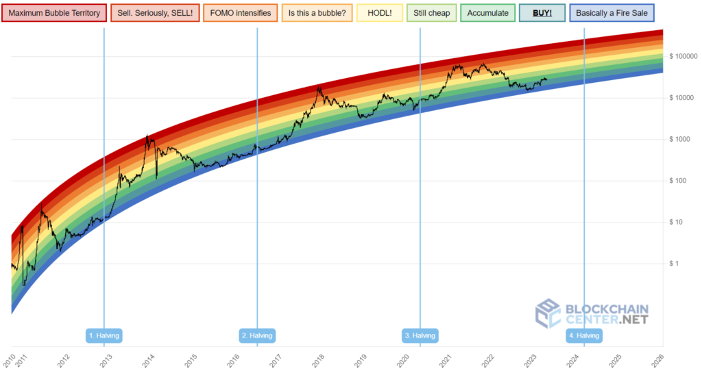
The DAO Hack (June 2016): Ethereum experienced a significant drop in price after the infamous DAO hack in June 2016. The Rainbow Chart shows that ETH entered the red zone, presenting an excellent buying opportunity for those who conducted their own research and believed in Ethereum’s long-term potential.
Bull Run of 2017: Ethereum’s price skyrocketed during the 2017 bull market, reaching an all-time high of around $1,400 in January 2018. The Rainbow Chart turned blue, signaling maximum bubble territory. Many investors who sold during this period were able to lock in substantial profits.
The Crypto Winter (2018-2019): Following the 2017 bull market, Ethereum’s price experienced a significant decline, as did the entire cryptocurrency market. During this period, the Ethereum Rainbow Chart remained mostly in the red and orange zones, indicating that ETH was undervalued and potentially presenting a good buying opportunity for long-term investors.
DeFi Boom and ETH 2.0 (2020-2021): The rise of decentralized finance (DeFi) and the anticipation of Ethereum 2.0 played a crucial role in driving Ethereum’s price upwards. The Rainbow Chart oscillated between yellow, green, and blue zones as ETH reached new all-time highs.
These historical events, as reflected in the Ethereum Rainbow Chart, showcase the importance of understanding market trends and being prepared to adapt to changing market conditions. Studying the chart’s history can help us learn valuable lessons and inform our future investment decisions.
It’s essential to note that past performance does not guarantee future results, and the Eth Rainbow Chart should be used as a supplementary tool, rather than the sole basis for your investment decisions. Always conduct thorough research, consider multiple sources of data, and stay up-to-date with developments in the cryptocurrency space.
IV. Limitations of the Ethereum Rainbow Chart
While we’ve discussed the many benefits of the Eth Rainbow Charts, it’s also crucial to acknowledge its limitations. I always emphasize the importance of understanding the shortcomings of any tool or model before relying on it. So, let’s dive into the limitations of the Ethereum Rainbow Chart and ensure we maintain a balanced perspective.
Not a standalone tool: The Eth Rainbow Charts should not be used in isolation. It’s essential to combine it with other forms of analysis, such as technical and fundamental analysis, to make well-rounded investment decisions. Always consider factors like relative strength, market cycles, and network growth before making any moves.
Based on historical data: The Rainbow Chart uses historical data to generate its logarithmic growth curve. While it’s essential to learn from the past, it’s important to remember that past performance doesn’t guarantee future results. Market conditions can change quickly, and new events or developments can have significant impacts on Ethereum’s price.
Doesn’t account for external factors: The Ethereum Rainbow Chart doesn’t take into account external factors that could influence the price of ETH. For example, it doesn’t consider regulatory changes, macroeconomic events, or developments in the broader cryptocurrency market, such as the performance of Bitcoin or Bitcoin Cash.
Subjective color-coded zones: The color-coded zones in the Eth Rainbow Charts are somewhat subjective, as they’re based on the chart’s creators’ interpretations of market conditions. Different investors may have varying opinions on what constitutes an undervalued or overvalued asset. As a result, it’s crucial to do your own research and form your own conclusions.
Not a predictive tool: The Ethereum Rainbow Chart is not designed to predict future price movements or exact entry and exit points. It’s a tool to help you quickly gauge the overall market trend and identify potential opportunities. Always remember that investing in cryptocurrencies carries inherent risks, and the Rainbow Chart should be used as a supplementary tool, rather than the sole basis for your investment decisions.
In summary, while the Ethereum Rainbow Chart is a useful tool for long-term investors, it’s crucial to understand its limitations and not rely on it exclusively for investment advice.
In the next section, we’ll compare the Ethereum Rainbow Chart with the Bitcoin Rainbow Chart and discuss the similarities and differences between the two.
V. Comparison with Bitcoin Rainbow Chart
In this section, we’ll take a closer look at the Ethereum Rainbow Chart’s older sibling, the Bitcoin Rainbow Chart, and compare the two. Understanding the similarities and differences between these charts can help us develop a more comprehensive understanding of market trends and make better-informed decisions. So, let’s jump right in!
Similarities
Logarithmic growth curves: Both the Ethereum and Bitcoin Rainbow Charts use logarithmic regression to create a growth curve that represents the overall trend of each respective cryptocurrency. These growth curves can help long-term investors identify potential buying or selling opportunities based on historical price trends.
Color-coded zones: The Ethereum and Bitcoin Rainbow Charts share the same color-coding system to indicate whether the asset is undervalued (red), fairly valued (green), or overvalued (blue). These color-coded zones can help investors quickly gauge market sentiment and make more informed decisions.
Focus on long-term trends: Both charts are designed to help long-term investors visualize the overall market trend and navigate market cycles more effectively. By using these charts, investors can identify periods of rapid growth, followed by price drops and consolidation phases.
Differences
Historical data: The Btc Rainbow Chart has a longer history, as Bitcoin was created in 2009, while Ethereum was launched in 2015. This difference in history means that the Bitcoin Rainbow Chart provides a more extended view of the market, which can be useful for analyzing long-term trends and cycles.
Underlying technology and use cases: Ethereum and Bitcoin have different underlying technologies and use cases, which can impact their price trends and market cycles. Ethereum’s focus on smart contracts and decentralized applications (dApps) has led to unique developments, such as the rise of DeFi and the upcoming Ethereum 2.0 upgrade. On the other hand, Bitcoin is often seen as digital gold and a store of value. These differences can result in distinct market behaviors and price movements, which are reflected in their respective Rainbow Charts.
Network effects and market dominance: Bitcoin has a larger network and market dominance compared to Ethereum. This difference can affect the price movements and volatility of each asset, as well as their susceptibility to external factors, such as regulatory changes and macroeconomic events.
In conclusion, while the Ethereum and Bitcoin Rainbow Charts share many similarities, it’s essential for users to recognize their differences and use them accordingly.
Always remember to conduct your own research, consider multiple sources of data, and be prepared to adapt to the ever-changing market conditions. By doing so, you’ll be better equipped to navigate the exciting world of cryptocurrencies and make well-informed investment decisions. Happy investing!
I recommend you to read the review of the Best Crypto Exchanges I wrote, comparing 15 of the most popular (and not) crypto exchanges.